Avatar with status indicator
If you just need a rounded avatar, you can achieve that by setting its width and height and then giving it a 100% radius. To get a bit fancier, you can also add a white border to make the avatar stand out on non-white backgrounds.

And here's the code for the above image:
1<img class="w-16 h-16 rounded-full border-2 border-white" src="https://pbs.twimg.com/profile_images/1333896976602193922/MtWztkxt_400x400.jpg"/>However, things get tricky if you want an avatar with something like an online/offline indicator or a badge kind of thing in the bottom right part of the avatar.
The key to getting this right is understanding how absolute and relative position elements play with each other.
Position absolute allows us to stack one element over others. Together with the left/right/bottom/top properties, we can control the exact position of the element, but - we need to make sure we have a relative parent; otherwise, the element will position itself in relation to the body element.
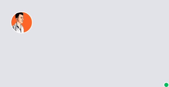
To fix it, we'll keep our initial avatar code, add a span for our status indicator, and wrap everything into a relative inline block element. Then we'll position the absolute status indicator in the bottom right corner of the avatar using the bottom-0.5 and right-0.5 classes.
1<div class="relative inline-block">2 <img class="w-16 h-16 rounded-full border-2 border-white" src="https://pbs.twimg.com/profile_images/1333896976602193922/MtWztkxt_400x400.jpg"/>3 <span class="w-4 h-4 rounded-full bg-green-500 border-2 border-white absolute bottom-0.5 right-0.5"></span>4</div>And here's the result:

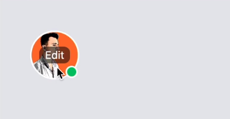
To push things even further, here's how to add an "Edit" button right in the avatar's center and have it appear only when the user hovers the avatar.
We'll add an absolute element inside the relative wrapper, and we'll stretch it by setting its left/right/top/bottom properties to zero; you can do that using the inset-0 class. Then, we'll add a button inside it, and to center it, we'll use flex items-center justify-center on the parent.
To make the button appear only on hover, we'll add the group class on the wrapper element, hide the button container using the hidden class, and use the group-hover variant to change its display to flex, which will make the button appear on the screen.